 Unless you’ve been living under a rock your entire life, you’ve definitely been handed your fair share of brochures. Whether you’re trying to drive traffic into a new gym location, showcase a property for sale or get the word out about your business, brochures are powerful and effective tools for engaging and educating any audience. But only if your brochure design is on point. When it comes to brochures, it’s all about the design. A great design will compel your audience to read all about what you’re doing. A less-than-stellar design will end up in the trash can. So how, exactly, do you design an awesome brochure? Never fear, we’ve got the ultimate guide to brochure design. By the end of this post, you’ll have everything you need to create, design, and print a great brochure that drives results and makes a lasting impact on your target audience. How to design a brochure |
 |  |
2- Define your ideal customer
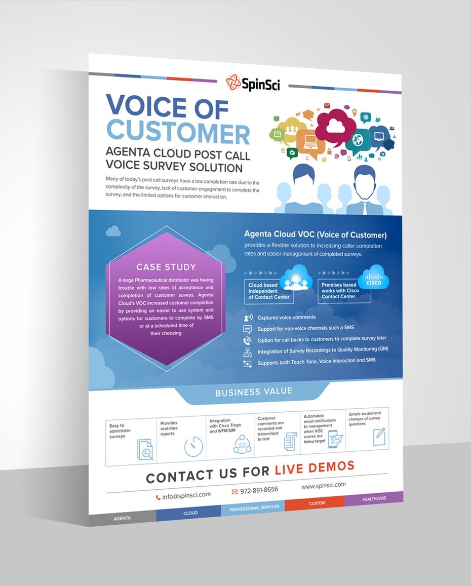
| Before you start designing your brochure, get crystal clear on who you’re designing for. Different audiences require different designs, and if you’re not clear on your audience, you run the risk of making the wrong design choices. In order to design a great brochure, you need to know your audience. Brochure design by Adwindesign for SpinSci TechnologyAsk yourself:
|  |
3- Develop your message
We touched on this above, but before you design your brochure, it’s so, so important that you define your message.
You need to know what you’re going to say in your brochure and how you’re going to say it before you even think about getting a design in place. Because your message is the most important thing. It all comes back to knowing your customer. If you don’t have a strong, clear message that speaks to them in language and images they can relate to, it doesn’t matter what design you come up with. Your brochure will fall flat.
For example, let’s say you were designing a brochure for new parents to advertise your children’s gym. Your message might be: “We’re fun and friendly—come join us!” So you want to use accessible, simple, friendly language and bright, vibrant imagery to match your brand and appeal to your target audience. Using complex language likely wouldn’t make sense to your customers.
On the flip side, if you’re designing a brochure to advertise your services as a financial advisor, your message will likely be quite different, so using simple language and bright imagery could feel too childish, and your ideal client wouldn’t take your message seriously.
Know your message before you design so you can make design decisions that strengthen your messaging.
4- Determine your metrics for success
 | Having metrics in place should be a non-negotiable for every brochure you design. Without metrics, you’ll have no idea if you should keep rolling with the same design for future brochures, or if you need to totally overhaul things to drive more results. Before you design, determine your metrics by defining what you’re hoping to get out of your brochure. Here are a few ideas:
|
5- Set your budget
| Your budget is more than just knowing how many brochures you can print. It determines everything from your type of paper to the fun printing techniques you can use to jazz up your brochure. Come up with a budget-per-print and start making some decisions based on what’s most important. Do you need your brochures to be extra sturdy? Invest in a thicker paper. Do you have a cool idea on how to illustrate one of your points? Look at more expensive ink options and printing techniques to bring your visuals to life. Knowing how much cash you have on hand for the design and printing process will help you make the best decisions for your budget and squeeze the most out of every dollar. |  |
Designing your brochure
Remember your brand identity
As you’re starting the design process, keep your brand identity front of mind. These elements describe the visual look and feel of your brand, and no matter what kind of brochure you’re designing, it needs to be consistent with your overall branding.
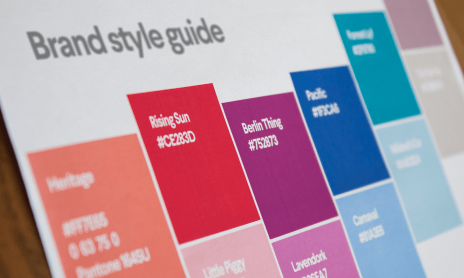
Choose design elements (colors, fonts, and images) that match your brand personality and the tone and content of your brochure. If you’ve already set your brand color and fonts, make sure you carry them over into your brochure design.
Design with the reader in mind
As a business owner or designer, it’s easy to get caught up in what you want. But, real talk? What you want doesn’t actually matter. It’s what your customer wants that counts.
When you’re designing your layout, keep your reader in mind. How would your ideal customer want to receive information? Are they OK with big blocks of text, or do they need things to be broken up with images so they don’t feel overwhelmed? Are their specific colors or fonts that would be particularly appealing to them? Where can you put all of your information (like your business name and contact information) so it’s easier for them to find?
When you’re designing, make sure to lay things out in a way that appeals to your customer.
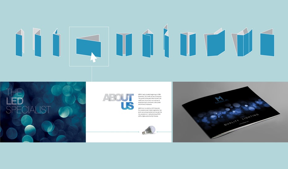
Choose your brochure type
You might think “Well, isn’t there just one brochure type… you know, like a brochure?” And the answer is no. There’s a laundry list of options when it comes to choosing your brochure type and the way it’s folded.


The brochure type that’s right for your brochure design is 100% going to depend on the content.
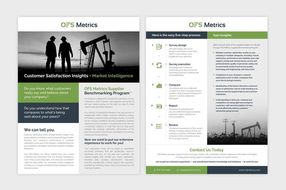
You might keep it simple with a Classic Tri-Fold. If you’ve got a ton of information you need to communicate, go for an option that has more space, like an Eight-Panel Roll Fold or a 16-Panel Fold. If you’re doing a step-by-step product tutorial, use a Four-Panel Roll Fold to make your content easy to follow for readers.
You might keep it simple with a Classic Tri-Fold. If you’ve got a ton of information you need to communicate, go for an option that has more space, like an Eight-Panel Roll Fold or a 16-Panel Fold. If you’re doing a step-by-step product tutorial, use a Four-Panel Roll Fold to make your content easy to follow for readers.
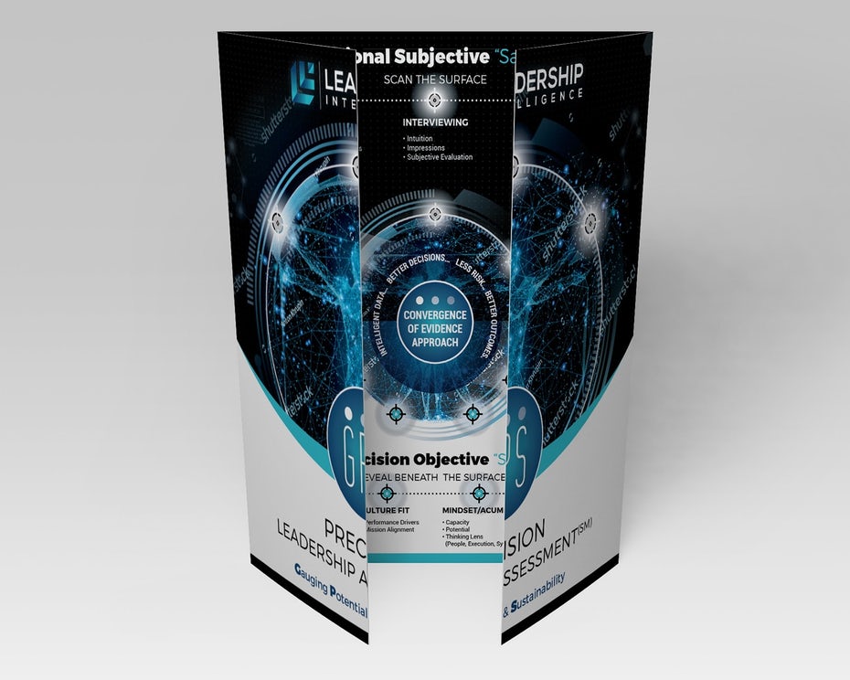
Single Gate Fold brochure design by zeljko_radakovic for Leadership Intelligence LLC
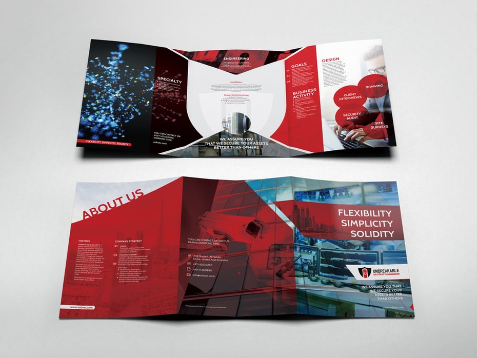
Classic Tri-Fold brochure design by YaseenArt for Unbreakable Security Company Brochure
Single Gate Fold brochure design by zeljko_radakovic for Leadership Intelligence LLC
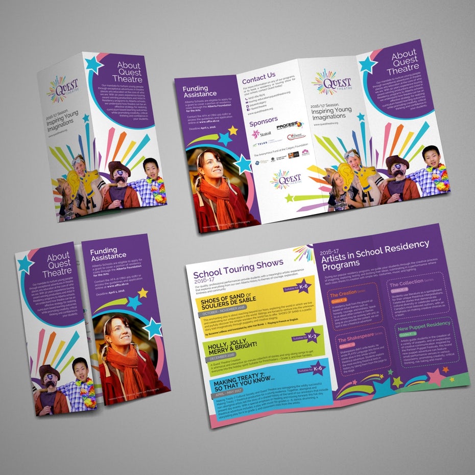
Double-Gate Fold brochure design by –Hero for Quest Theatre
Also consider how your brochure is ultimately going to be delivered.
Are you going to put the brochures on a rack? Are you going to stuff them in a bag with other promotional goodies? Are you going to send them as a mailer? How you plan to deliver or display your brochures will go a long way in determining which fold is the best choice for you and your business.
Are you going to put the brochures on a rack? Are you going to stuff them in a bag with other promotional goodies? Are you going to send them as a mailer? How you plan to deliver or display your brochures will go a long way in determining which fold is the best choice for you and your business.
Gather your copy and images
Have your copy and images ready to go before you start putting pen to paper and creating a design. This will help you make important decisions about layout, length, font size, and more.
But don’t get too attached. Chances are that design restrictions will affect how much text or how many images you can include. Be flexible and make sure your main points make it in.
Start with your ideal amount of copy. Including a lot of copy in your design can deliver a lot of information for your readers. However, those huge text blocks can feel overwhelming and actually discourage them from reading. Shoot for something in the middle.
Use headlines and sub-headers to structure your text and make it skimmable for readers who don’t have the attention span to read the entire thing (and trust us, they exist). Your headline is especially important. You only get one chance to grab your audience’s attention.
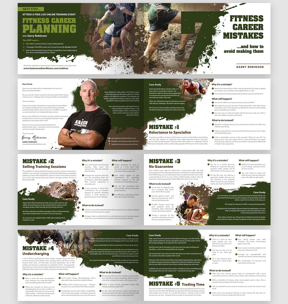
Text heavy brochure design by Rose” for Kaizen Outdoor Fitness
Then, do the same with your images. Gather them all in front of you and figure out which ones will help tell your story and where they should be placed. Your images are the first things people will see, so they should help you connect with your reader and illustrate what you do.
As you develop your design, your copy and image selection will likely grow and shrink. Again, be flexible and use these creative elements to tell the story your audience needs to hear.
As you develop your design, your copy and image selection will likely grow and shrink. Again, be flexible and use these creative elements to tell the story your audience needs to hear.
1 Comment
Alfie Ponte
Graphic Designer / Art director
Inspiration for design lovers, with a focus on techniques, best practices and useful resources / assets.
 RSS Feed
